eConsent at Castor
The redesign I argued against shipping.
- Problem
- Castor makes software for decentralised clinical trials. In eConsent, participants read and sign the informed consent form, a regulated document that can decide a trial's start date. Customers were blocked by the builder for that form.
- What I did
- I led the research and a Design Dash, designed a new builder, and tested it with clients, participants and internal experts.
- Result
- I recommended four targeted fixes over a rebuild, and engineering shipped them.
Tested with three audiences.
Clients, trial participants and internal experts, all before anything was built.
Four targeted fixes instead of a rebuild.
The research moved the roadmap away from a rebuild.
Consent forms were taking an hour, and most of it was QA.
Discovery calls and support tickets kept naming the same problems. The builder was missing components, pasted text lost its formatting and the preview didn’t help much. Building one consent form took anywhere from fifteen minutes to an hour, and the signing experience for participants wasn’t much better. A better builder looked like the obvious answer.
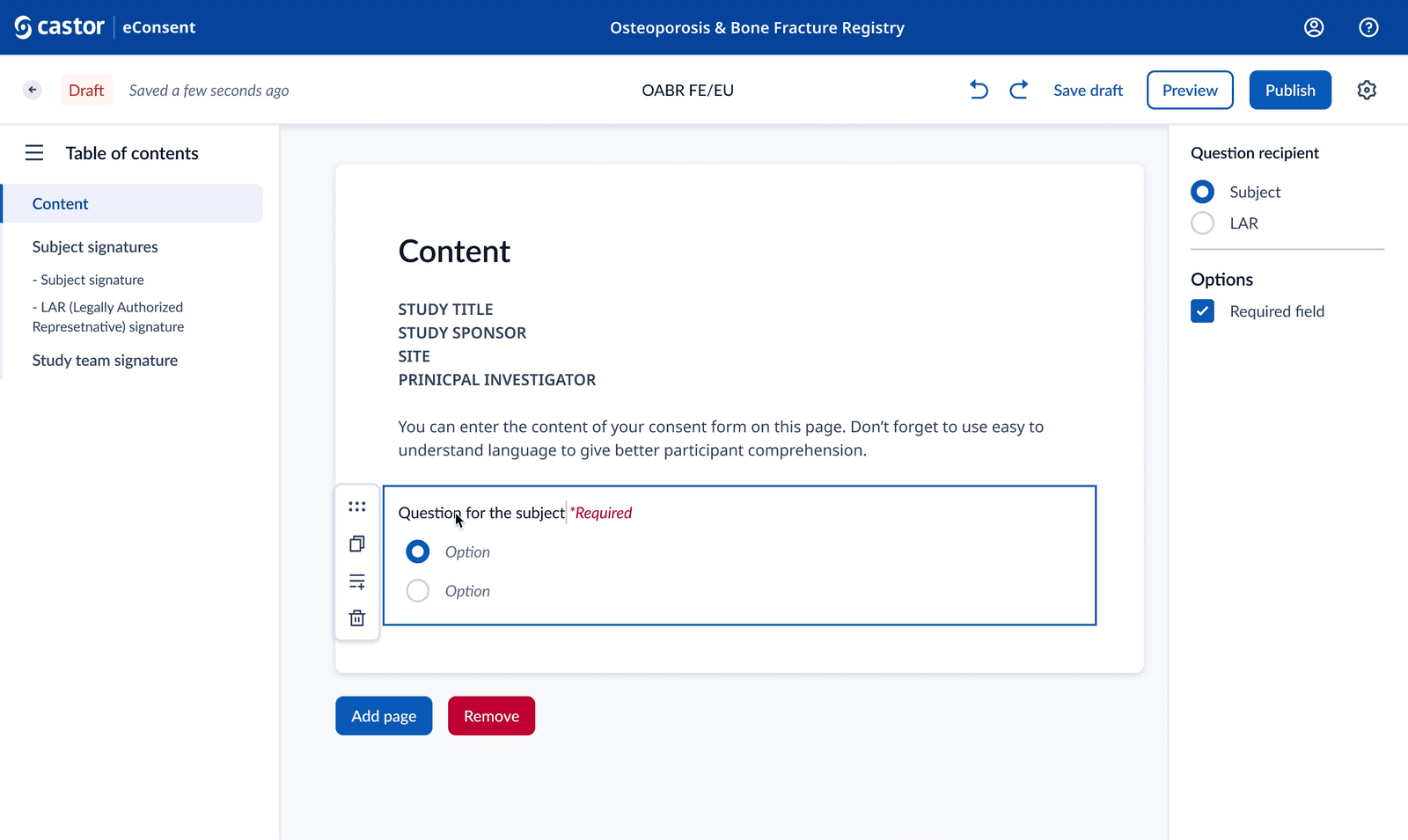
In the flexible builder, questions can target the subject or their legal representative, which most form builders can’t handle.
The new builder prototype. Questions can target the subject or their legal representative, and the table of contents builds itself.
I designed it fully before testing it.
Interviews, competitive analysis and compliance research turned into design requirements, which the heads of product and design signed off. I wrote two personas with full journeys, one for the researcher building the form and one for the participant signing it.
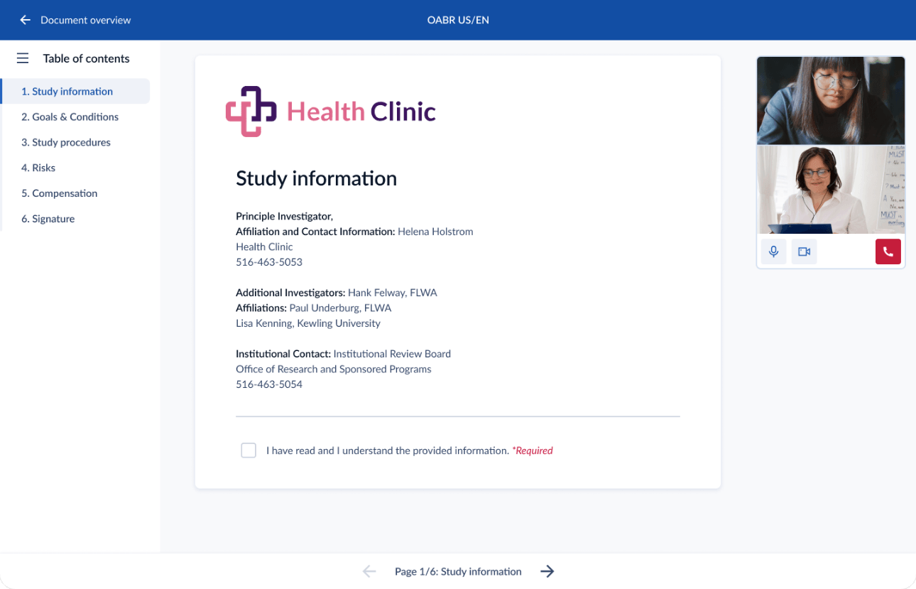
I ran a 2.5-hour Design Dash with engineers, using Crazy 8s and storyboards, so the whole team owned the concept before anything was drawn. Then I prototyped the new builder and a six-step participant journey with comprehension checks and live video support.
Engineers helped shape the concept, so we made the later pivot together.
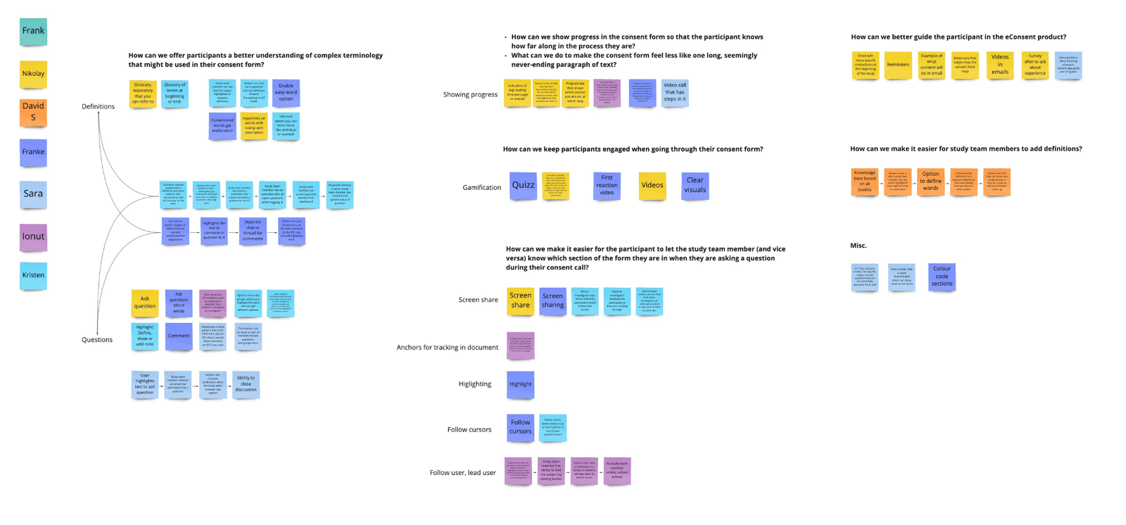
Testing showed the current builder was good enough.
I ran moderated usability tests with participants, clients and internal experts. They found the new builder easy to use and liked its table of contents, but they also told us something more useful. For the copy-paste workflow most clients actually have, the current builder already worked. The real problems were formatting, media, preview and QA time, and all four could be fixed without a rebuild.
So I recommended against my own design, and the four fixes shipped instead.
“If you want to do a copy/paste job the current builder works just fine. However, the industry is moving towards more flexible solutions which this new consent form builder provides.”
I recommended four fixes instead of a rebuild.
The fixes covered formatting, media and preview, and better in-app guidance meant customers could build their own forms without going through professional services. The flexible builder can wait until there’s real, measured demand for it.
Parts of the participant prototype did ship.
What I'd do differently.
I’d have put the prototype in front of clients earlier, because an earlier round would have reached the same answer sooner and for less. I’d also have agreed a number upfront for how much demand would justify the flexible builder, so we could decide on the number instead of arguing about it.